How to Choose Calm Colors for Your Home
Why Calm Colors Work in the Home
Calm colors can make a home feel more comfortable, welcoming, and easy to live in. They help create a peaceful background for daily routines while allowing furniture, artwork, and personal items to stand out.
Soft blues, gentle greens, warm whites, muted grays, and earthy neutrals are popular choices for relaxing interiors. However, a calm color scheme does not have to look plain or cold. The key is to choose colors with the right undertones, combine them thoughtfully, and consider how natural and artificial light affect each shade.
Start by Defining the Mood
Before choosing paint or accessories, think about how you want the room to feel. Different colors can support different moods, even when they are all soft and subtle.
- Soft blue: Creates a quiet, airy feeling and works well in bedrooms, bathrooms, and reading areas.
- Muted green: Brings a natural quality to a room and can feel refreshing without being too bright.
- Warm white: Keeps a space light and open while adding more comfort than a stark white.
- Beige and taupe: Offer a gentle, versatile foundation for traditional or modern spaces.
- Soft gray: Provides a clean, balanced look when paired with warm wood, textured fabrics, or natural materials.
- Dusty pink: Adds warmth and softness without overwhelming the room.
Ask yourself whether you want the space to feel airy, cozy, natural, or balanced. This simple decision can narrow your choices and make the selection process easier.
Understand Warm and Cool Undertones
Two colors may look similar on a paint card but appear very different on a wall. One reason is undertone. An undertone is the subtle color beneath the main shade.
Warm colors often contain hints of yellow, red, or brown. Cool colors may contain hints of blue, green, or violet. Warm whites can feel inviting, while cool whites may look crisp and modern. A gray with a blue undertone can feel clean and airy, while a gray with a beige undertone may feel softer and more relaxed.
Try to identify the undertones in the room’s existing features, including:
- Wood flooring and furniture
- Countertops and tile
- Rugs and curtains
- Metal finishes such as brass, chrome, or black hardware
- Large artwork or patterned fabrics
You do not need to match every element exactly. Instead, choose colors that relate comfortably to the features already in the room.
Consider Natural Light
Light has a major effect on how color appears. A shade that looks warm and soft in a sunny room may look darker or more muted in a space with limited windows.
Rooms with strong southern or western light often receive warmer sunlight. Cool shades can help balance that warmth, while soft neutrals can maintain a comfortable feeling. Rooms with less direct light may benefit from warm whites, light beige, pale green, or gentle blue shades that keep the space from feeling too dim.
Also consider the time of day when the room is used most. A bedroom viewed mainly in the evening may look different under lamps than it does in the morning. A living room with daylight from several windows may show more variation throughout the day.
Test Colors Before Committing
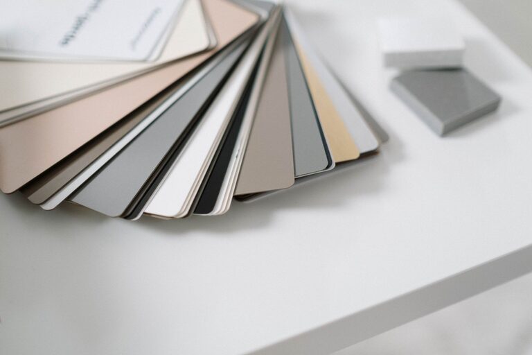
Never rely on a small color card alone. Paint a sample on a large piece of white poster board or a section of the wall. Move the sample around the room so you can see it in different locations.
Check the color:
- In the morning, afternoon, and evening
- Under natural and artificial light
- Next to flooring, furniture, and trim
- With curtains open and closed
Give yourself at least a day or two to live with the sample. A color that seems perfect at first glance may feel too cool, dark, or bright after several hours. Testing also helps you compare multiple options without making a rushed decision.
Build a Simple Calm Color Palette
A balanced palette usually includes a main color, a supporting color, and one or two accent shades. This approach creates variety without making the room feel busy.
Use the 60 30 10 Approach
A helpful starting point is the 60-30-10 approach:
- 60 percent: The main color, often used on walls and larger surfaces.
- 30 percent: A secondary color found in furniture, curtains, rugs, or cabinetry.
- 10 percent: An accent color used for cushions, artwork, lamps, or decorative objects.
For example, a room might use warm white on the walls, light wood and soft gray for the secondary tones, and muted blue as an accent. The proportions do not need to be exact. They simply help keep the overall look organized.
Choose Related Shades
For a subtle, peaceful room, select colors that are close to one another on the color wheel. Soft blue and blue-gray, sage and olive, or beige and taupe can create gentle contrast while maintaining a unified appearance.
You can also use one color in different strengths. A pale green wall, medium green chair, and deeper green accessories can create depth without introducing many separate colors.
Use Neutrals with Texture
Neutral rooms can feel calm, but too many flat surfaces in similar shades may look dull. Texture adds interest without disrupting the peaceful atmosphere.
Combine materials such as:
- Woven baskets
- Linen curtains
- Soft cotton cushions
- Natural wood
- Wool or textured rugs
- Matte ceramic accessories
A room with warm white walls can feel much more inviting when it includes textured fabrics, wood grain, and layered lighting. These details add visual depth while keeping the color scheme restrained.
Choose Colors by Room
Different rooms can benefit from different types of calm colors.
Living Room
The living room often works well with versatile shades such as warm white, soft gray, beige, or muted green. These colors provide a flexible background for furniture and artwork. If the room already contains bold patterns, choose a quieter wall color to create balance.
Bedroom
Bedrooms are ideal for soft, low-intensity colors. Pale blue, gentle green, dusty rose, and warm neutral shades can create a restful feeling. Avoid choosing a color only because it is trendy; select one that you enjoy seeing at the end of the day.
Kitchen
Kitchens often benefit from clean, welcoming colors. Cream, light gray, soft sage, and warm white can complement wood cabinets, stone surfaces, and metal fixtures. If the kitchen is small, a light color may help it feel more open.
Bathroom
Bathrooms can feel fresh with pale blue, soft green, warm white, or light gray. Use towels, rugs, and small accessories to introduce gentle contrast without making the space feel crowded.
Avoid Common Color Mistakes
Calm colors can lose their effect when the palette is too complicated or the shades are poorly matched. Keep these tips in mind:
- Do not choose every room color separately without considering how the rooms connect.
- Avoid using too many strong accents in one space.
- Be careful with cool gray in rooms that already have limited natural light.
- Do not assume a color will look the same in every room.
- Remember that ceilings, trim, and doors also affect the overall palette.
Create a Home That Feels Like You
The best calm color scheme is one that suits both the space and the people who use it. Start with colors you naturally enjoy, then adjust them based on lighting, room size, and existing furnishings.
Choose a few samples, test them carefully, and allow the palette to develop gradually. With soft shades, thoughtful contrast, and plenty of texture, you can create a home that feels peaceful, comfortable, and personal without looking plain.

Related Posts

How to Refresh Your Home with Plants